Belle Maison | The Edwards Family

This Modern Space
-Liesel Schmidt
With its geometric design and clean lines, the white stucco home owned by Miguel and Yvonne Edwards follows the aesthetic of so many European homes, giving it a unique appeal against the contrasting designs of the other homes in its Mandeville neighborhood. Designed by Matthew Voelkel, the house offers dramatic curb appeal created by its deceptively simple exterior, comprised of geometric shapes accentuated by a complex arrangement of substructures linked by architectural corridors.
At 4000 square feet, the two-story home is a spacious one, boasting four bedrooms and four baths, with an incredibly open floor plan made even more airy by dramatically high ceilings and multitudinous windows. The modern aesthetic is continued throughout with a mix of fashion-forward colors and materials, though despite its visual appeal and stylishness, there is nothing about the home that isn’t functional to living or too precious to be lived in—which, with a household that includes three boys, is crucial. “With a bustling home of five, our interior design had to be both elegant and functional,” notes Yvonne, who is a stay-at-home mom and an R.N., while Miguel is the Chief Information Officer for (PALIG) Pan-American Life Insurance Group.
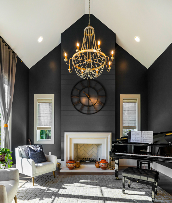
Unifying the entire home engineered hardwood floors run throughout, accented by bold, oversized blue slate tiling in the entryways. Just to the left of the front entry, a space originally intended as the formal dining was transformed into an intimate music recital space for the Edwardses’ three young musicians, featuring a baby grand piano and lush seating. To the right is a formal living area, the two rooms divided by a hall with exposed beams overhead and gold geometric chandeliers, adding warmth to an otherwise stark space. In an alcove between the formal dining room and the open plan kitchen, a bar expands the length of the wall, with custom storage cabinetry and a wine cooler. Just steps away, the U-shaped kitchen centers around a massive island whose dark gray cabinetry stands out in stark contrast against the white cabinets of the perimeter. “The kitchen is definitely a focal point of the home,” says Yvonne. “Given the openness of the floorplan, from nearly any work surface within the kitchen, you can seamlessly participate with family members in the eating area or living room.” The stainless-steel range is complimented by a beautiful white tile backsplash with ornate gold inlay, an echo of other gold design elements throughout the home that provides a stark contrast against the largely white colorways of the home. The oversized center island provides ample prep space as well as a gathering point for the family and their guests.


